Publish on:
Mar 31, 2025
12 mins read
Here's a small anecdote to understand the Product better 🤩
Meet Ankit, a seasoned sales executive juggling multiple deals. Every morning, he opens his laptop, ready to chase new opportunities, but instead, he finds himself drowning in scattered spreadsheets, outdated contact lists, and hours of manual data entry. By the time he gathers the right information, he’s already lost valuable time and potential clients.
Ankit’s struggle wasn’t unique. Sales teams across industries faced the same frustrating reality: disorganized data, inefficient workflows, and a lack of seamless data enrichment.
The solution? CallPrep a Sales Intelligence and Productivity Agentic Platform and Technology, designed to transform the way SDRs and AEs selling to BFSI and Retail enrich their data by providing insights of potential clients.
Understanding the Problem: Where It All Began
Before designing anything, I first wanted to understand what they do and the problems they solve as I had no knowledge of how sales teams work or the challenges they face. So, I stepped into the shoes of our users, conducting in-depth interviews with founders and sales professionals to hear their challenges:
“Sales team spent hours finding the right contact information.”
“Manually updating data is exhausting and prone to errors.”
“I need a smarter way to manage my leads, not just another spreadsheet.”
Now the mission was clear: Design a platform that makes sales data management intuitive, efficient, and powerful.
This was the previous design of CallPrep, lacking a clear design system. This led users face problems while accessing the product to it's full potential.
My Role: Designing for Real Impact
As the Product Designer, I was tasked with turning frustration into functionality.
My approach involved:
Researching pain points through user interviews.
Mapping user journeys to eliminate friction in workflows.
Sketching wireframes that laid the foundation for a seamless experience.
Designing high-fidelity UI screens that prioritized usability and efficiency.
Collaborating with developers to bring these designs to life.
Testing and iterating based on real user feedback.
With these pillars in place, we set out to craft a product that would truly make a difference.
The Design Process: Crafting the Perfect Sales Companion
1. Research & Discovery
We started by mapping out the daily struggles of sales teams.
Key insights emerged:
80% of users spent excessive time searching for the right data.
60% relied on external tools to enrich information.
70% wanted a faster way to import and organize files.
I also studied existing platforms, identifying gaps and opportunities to create a simpler, smarter, and more integrated solution.
After analyzing competitors, I found that Apollo.io and Persona.ai had poor user experiences with cluttered dashboards that distracted users from their primary goals. In contrast, Clay.com offered a seamless experience, and the founders of CallPrep wanted something similar.
2. Ideation & Prototype
I started by designing a low-fidelity prototype and converted it into a functional prototype after feedback and iterations, focusing on one goal speed and simplicity."
Dashboard Design – Designed for instant visibility and quick access to key insights, enabling users to get a snapshot of their data at a glance.
Seamless CSV file Upload – Simplified the flow so users can effortlessly upload CSV files and get enriched data within seconds.
Redesigned Account View Section – Simplified a cluttered layout into a clean, well-structured interface with improved visual hierarchy and spacing for better usability.
Credit-Based Enrichment – Introduced a structured credit system for controlled and efficient data usage, keeping things transparent.
Optimized Table Design – Focused on visual hierarchy and ease of use to ensure clarity when scanning large datasets.
➩ How I designed Dashboard?
During the Information Architecture phase, I initially placed the "Upload CSV File" button inside the "Create" button. However, research revealed that uploading CSV files was a frequently used feature. To improve accessibility, I decided to place it directly on the dashboard.
The next challenge was determining the best placement for buttons. I implemented the bento design concept to create a visually organized and user-friendly dashboard. See the design iterations below⤵︎
➩ How I designed seamless experience of uploading CSV file?
Since uploading CSV files is one of the most frequently used actions on CallPrep, I focused on making this flow as intuitive and frictionless as possible. The experience starts with a clearly visible "Upload CSV" button right on the dashboard, allowing users to get started instantly. I implemented a simple drag-and-drop interface along with the traditional file picker to offer flexibility. Once a file is uploaded, the system provides real-time validation to ensure the correct format and structure, minimizing user errors. A progress bar and visual feedback reassure users that their file is being processed. Right after uploading, users are guided into the enrichment flow, making the entire journey smooth, fast, and efficient just like we intended.
➩ How I redesigned "Account view" section?
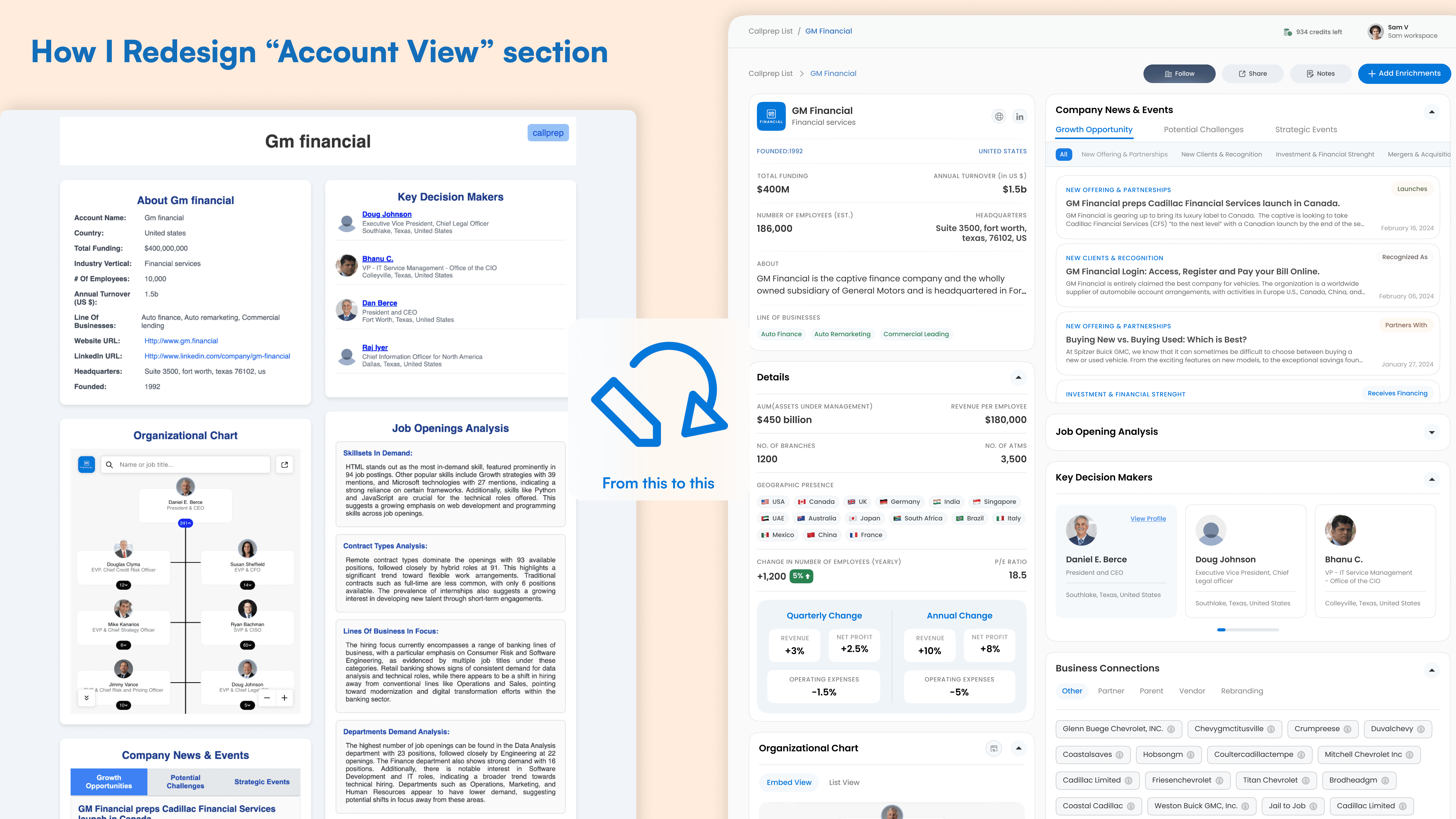
When I first looked at the existing Account View section, something immediately felt off. While it served the purpose functionally, the interface felt cramped, visually noisy, and lacked a clear hierarchy. The user information and actions were scattered without proper alignment, and it was difficult to quickly focus on what mattered most. I asked myself "What if I could make this section feel as seamless as the rest of the product experience?"
Then I started by identifying key usability issues in the old design:
Poor Visual Hierarchy: User details, buttons, and tags all competed for attention.
Lack of Spacing: Everything felt tight, making it hard to scan quickly.
Cluttered Layout: Important actions like "Edit" or "Delete" weren’t intuitively placed.
Missing Personal Touch: The account section lacked personalization or emotional connection.
I broke the redesign down into three goals
Improve Clarity: Focus on clear layout and readable text.
Introduce Structure: Use grid alignment, spacing, and logical grouping of information.
Enhance Usability: Make actions easier to find and interact with.
The new Account View feels structured, modern, and easy to use. Users can now quickly understand the information presented, take action with confidence, and enjoy a more visually pleasing interface.
This redesign wasn’t just about aesthetics it was about creating a seamless experience, where clarity meets function, and every pixel serves a purpose.
➩ Improved Navigation with Arrow Controls
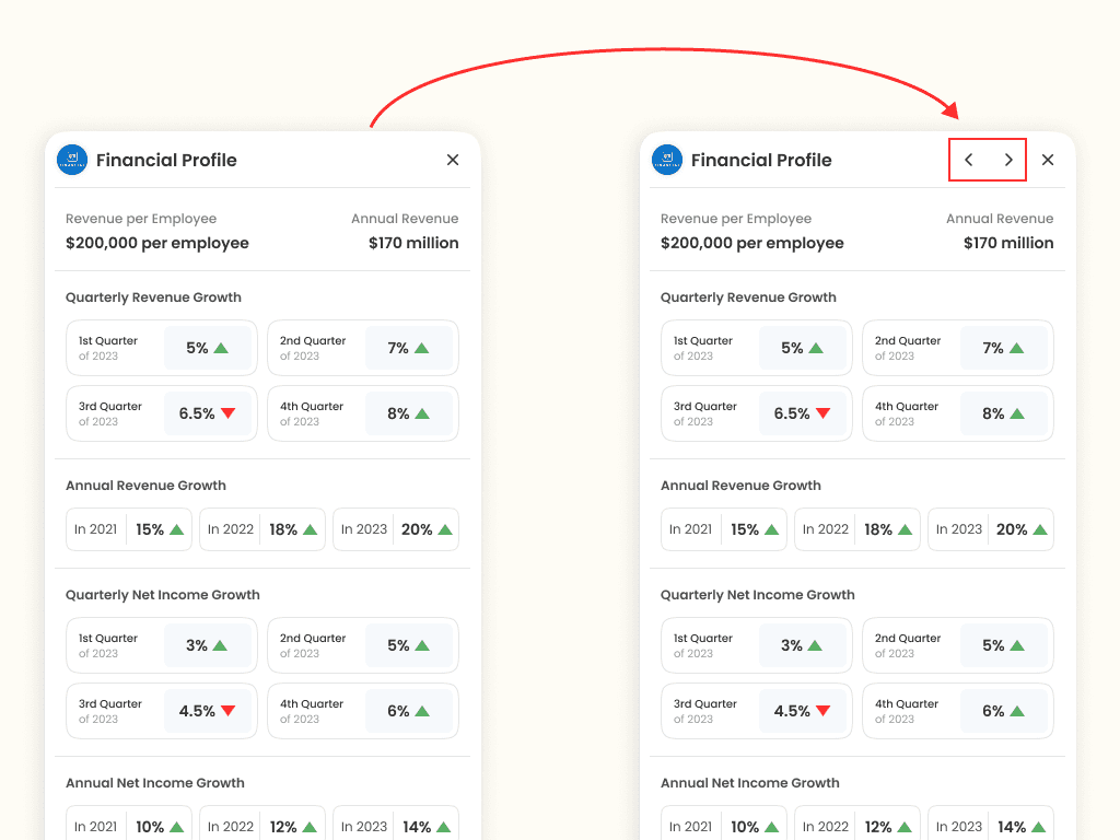
During usability testing, I noticed a friction point users had to close the insight panel to view the next account's data, which disrupted their workflow. To solve this, I introduced arrow controls, allowing users to seamlessly navigate between profiles without closing the panel. This small change significantly improved the efficiency and fluidity of the experience.
The Outcome: Transforming Sales Workflows
CallPrep wasn’t just about creating a product it was about solving real problems. From Ankit’s frustration to a seamless, efficient sales tool, this journey reinforced the power of design in transforming workflows.
Faster data retrieval, boosting efficiency.
Reduction in manual data entry efforts.
Increased adoption thanks to an intuitive experience.
Overwhelmingly positive feedback from sales teams.
Lessons Learned & Future Vision
Every great product is built on continuous learning. Here’s what we took away from this journey:
✅ User feedback is everything: Real insights led to real improvements.
✅ Simplicity wins: A clean, intuitive interface drove adoption.
✅ Iteration is key: Testing early and often helped us fine-tune the experience.
Looking ahead, we aim to integrate AI-driven data enrichment and advanced analytics dashboards to provide even deeper insights for sales teams.
❤️ Thanks for reading...